Identity for Brindisa’s
Cheese Rooms
Branding & Identity
Logo design
Solution
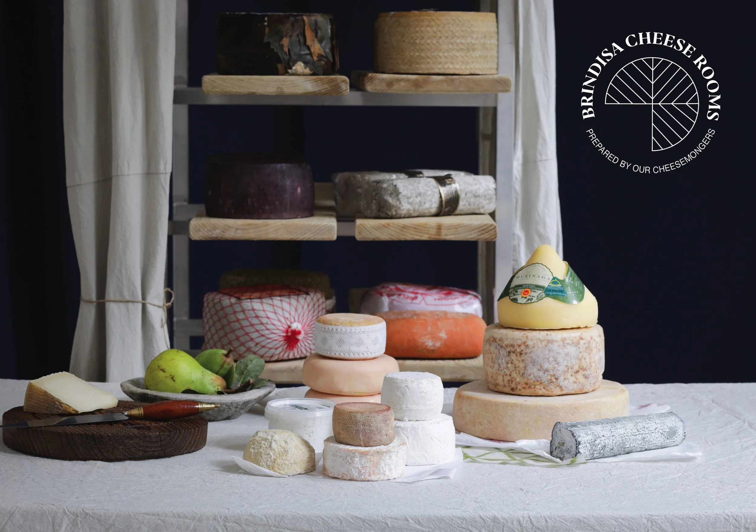
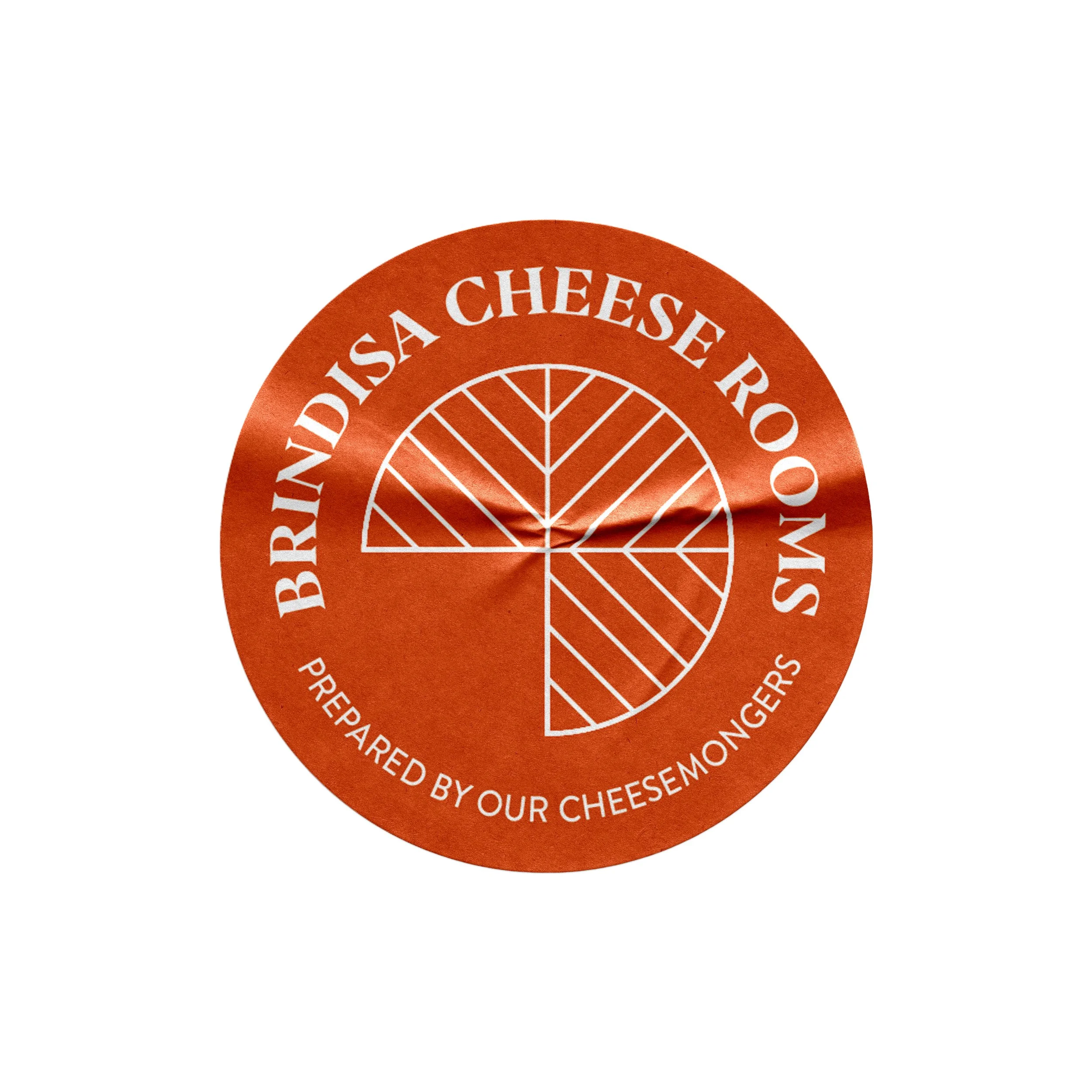
A logo that takes a bird's-eye view of a Manchego rind pattern, a bold visual reference to Spain's most iconic cheese and Brindisa’s biggest seller, designed to work across packaging, gift box inserts, posters, and
digital platforms.
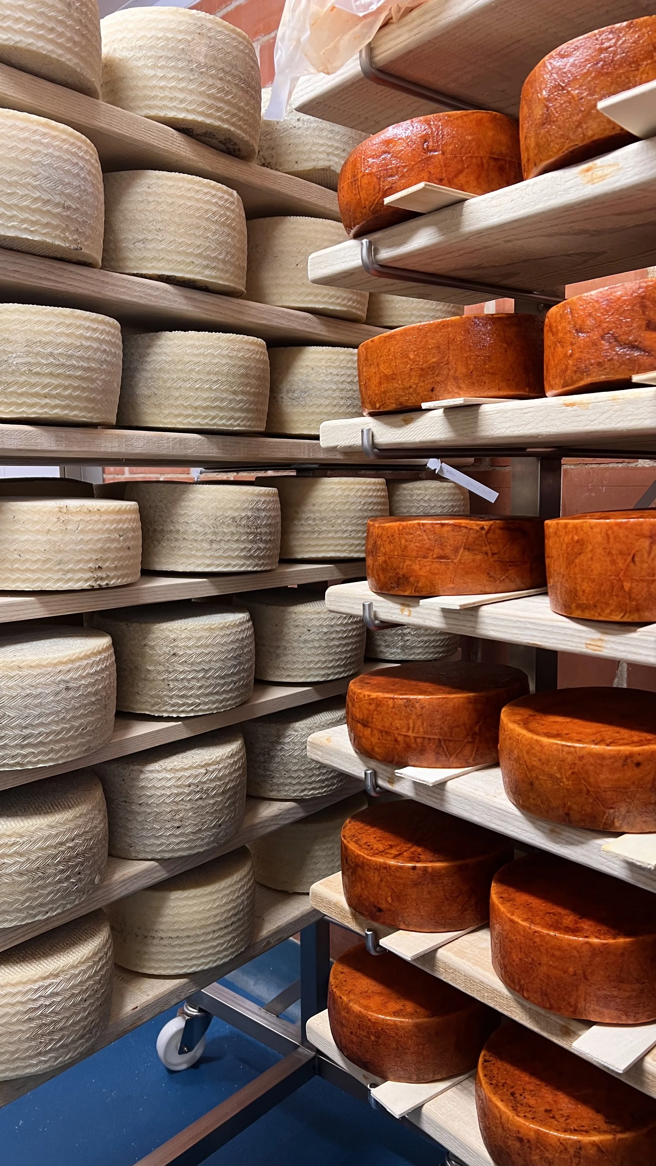
The pattern itself has a rich history: originally formed by the wicker baskets used to mould the cheese curds, it is now recreated with specially designed moulds that preserve this imprint. That heritage is carried into the identity.
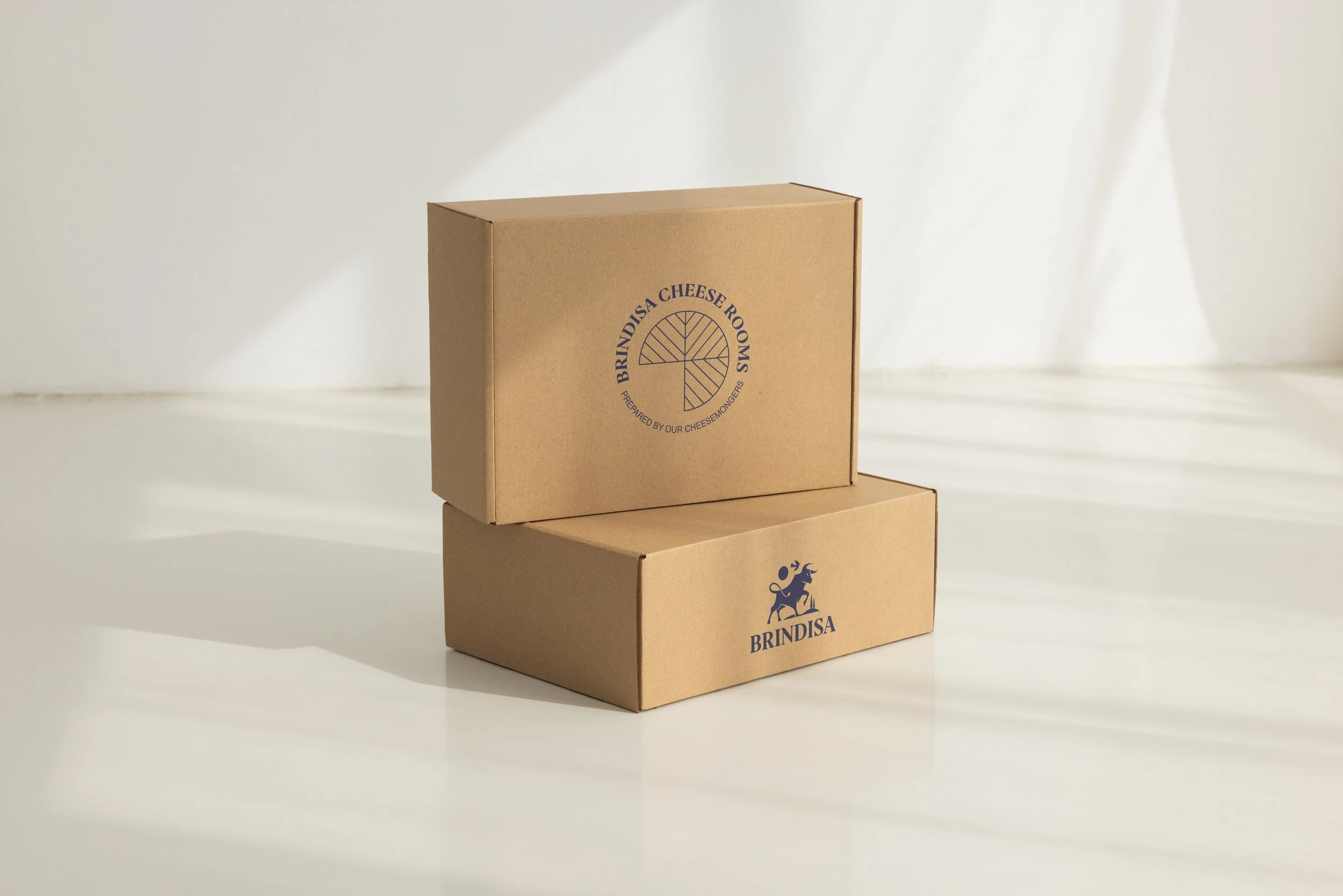
The orange sticker has been launched across all e-commerce
cheese packaging.
Brief
Brindisa Spanish Foods houses a hidden asset: the Cheese Rooms, a highly technical maturation space dedicated to hand-crafting imported Spanish cheeses to their peak. The problem is that almost nobody knows it exists. The brief: to develop a distinctive sub-brand that gives the Cheese Rooms the recognition they deserve.
Contribution
Freelance.
Skills: Illustrator, Photoshop, Procreate.
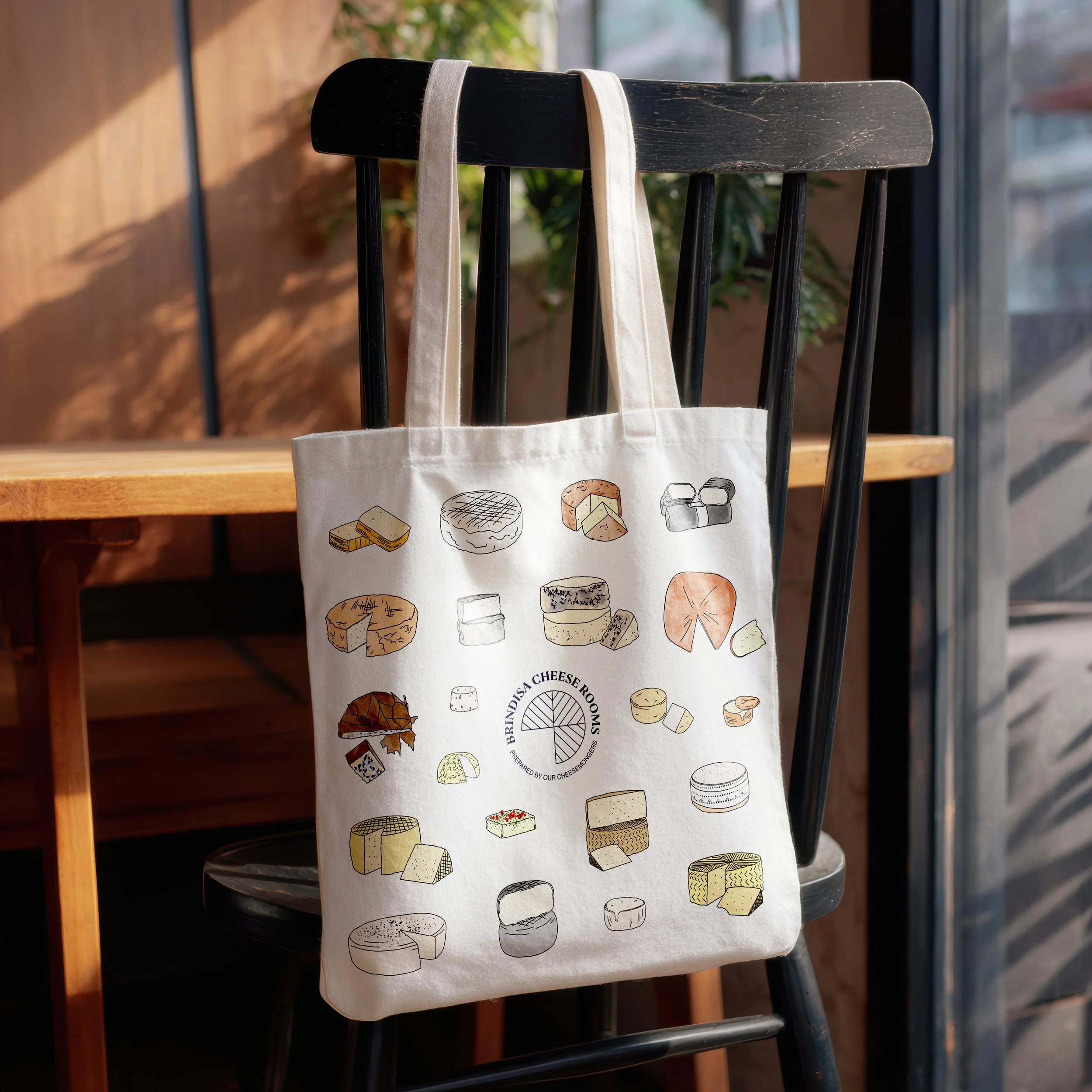
Hand-drawn illustrations of the cheese selection accompany the graphics to reflect the brand’s emphasis on hand-prepared cheese.